
Numbers are often boring and difficult to put into context. They’re misleading, intimidating, and abstract.
But when used with care and purpose, numbers become important, concise, expressive. They make up a language we all speak, and the right collection of numbers can tell a story waiting to be told.
Numbers Telling Stories
Here are some numbers that I believe tell important stories:
-
In 2006, the U.S. spent the 2nd highest amount in the world on primary school education per student (~ $10,000 per student); yet, in 2009 U.S. students ranked 30th internationally in Math, 23rd in Science, and 17th in Reading (based on 2009 PISA Rankings) [1]
-
In 1804, world population reached 1 billion people. It took 124 years to get to 2 billion people. It took just another 87 more years to reach a total of 7 billion in 2013.
-
In 2011, the top 1% of Americans averaged a household income of $27 million. The bottom 90% averaged $31,000. [2]
-
Life expectancy in Japan is 84 years, in the United States – 78, India – 67, and Afghanistan – 50 years (2013 data). [3]
-
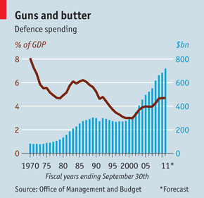
The U.S.’s military spending budget for 2013 is greater than the next 10 countries’ (top 2 through 11) military spending combined. About one week of US Military spending could pay for ending world hunger (estimate of $30 billion per year by the FAO). [4] The 2013 military budget divided by the U.S. population amounts to $2,178 per American. [5]
Finding Meaningful Numbers
These numbers are important because they ask the question, “How are we doing?” But even numbers that report on the state of the whole will fail to be useful if they don’t evoke some sort of emotion. For example, none of the numbers above are told in isolation – the numbers are ranked, compared across entities, compared across years, and reframed as units per person. The stories reveal themselves because we automatically feel some emotion when looking at comparative data. Essentially, these are numbers that you can and should convey using visualizations – line graphs, bar graphs, scatterplots, tree maps, etc.
Numerical stories also should not settle on a single point in time – instead, collect numbers that span multiple months or years. A trend emerges. Now you have a story of growth or decline, of snapshots in time when something appeared to matter, of turning points where forces decided that a change had to occur, or of a problem largely ignored or unfixed and escalating toward disaster. Unfortunately, numerical trends often do not appear in typical news reporting, which often pay homage to the most recent tragic event in our 24-hour news cycle. A single event may tell us what happened yesterday, but numerical trends show us the behaviors of our systems.
“We are less likely to be surprised if we can see how events accumulate into dynamic patterns of behavior. The team is on a winning streak. The variance of the river is increasing, with higher floodwaters during rains and lower flows during droughts. The Dow has been trending up for two years. Discoveries of oil are becoming less frequent. The felling of forests is happening at an ever-increasing rate.”
– Donella Meadows, Thinking in Systems
Asking Meaningful Questions
But having data on all the numerical trends in the world still won’t provide us with answers to solving the toughest problems – they can only direct us to ask the right questions. If we want to see numbers change for the better, we have to understand the system – the relationships, the incentives, the causes and their effects and their causes and their effects. Great journalism tells stories by striking a balance between numbers, character portraits and investigations into the deeper structural causes of a problem. Here are my follow-up questions to the five numerical stories above:
-
Why is the U.S. inefficient on its public education expenditures? Are there lessons to be learned from other countries’ education systems to find more effective policies?
-
What are the costs on the environment when population grows exponentially in such a short period of time? Are there limits to growth?
-
What is driving the discrepancy in average income? Is there a true difference in work ethic and quality of education between the rich and the poor that can justify such a huge gap? What are consequences to a society when such a gap exists, and should we care?
-
What are the main reasons driving the low lifespan in some countries, and which public policy actions can be taken to address those problems? Do we see that the quality of life for those living in countries with long lifespans is also significantly higher?
-
What is most of this spending paying for, and why do Americans believe a large defense budget is imperative? What percentage of total government spending is devoted to our military budget?
The questions of inquiry above begin to tease out questions of ethics and values. What in our world is right or wrong, and is this trend good or bad? What is my role in acting on this type of information if it makes me uncomfortable? Should I care about what happens to society as a whole, and if I don’t, why not?
Finding Numbers that are Meaningful
Ultimately, I believe that numbers are meaningful when they communicate information about the well-being of societies – of happiness. Many of the numbers I’d like to see are almost impossible to measure objectively and collect data on, and others just aren’t shared widely…
-
Hours of leisure time the average person experiences per week
-
Number of daily hugs received
-
School students’ level of engagement
-
Amount of love experienced
-
Amount of insecurity experienced
-
Job enjoyment level
These things are difficult to measure, but certainly worth thinking about if we believe quality of life is more than just GDP and annual salary. If a government only had conversations about conveniently measurable statistics, then many important aspects of the human condition would be left out of our equations. What if the stats above could be collected and aggregated by geography, income level, gender, age, and career field? What if they were collected monthly so we could notice upward and downward trends? If you saw that all the metrics above were moving in an undesirable direction, but meanwhile GDP was still growing, how would that impact your perception of wellbeing?
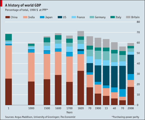
In fact, GDP is one of those numbers that we do an excellent job understanding from a mathematical perspective – we pay a ton of attention to it, we make comparisons across countries, we use it as a variable to measure economic success in many research studies. Google GDP, and you’ll have no problem finding graphs, articles, blog posts analyzing, predicting, obsessing over it – the graph below is one of the images that showed up from a web search. In other words, we have very meaningful numbers about GDP; but is GDP meaningful? (In recent years, there have been efforts toward creating better indices such as the OECD Better Life Index and Gross National Happiness).
Having meaningful numbers can help us better understand the world, but having numbers that are meaningful will help us improve the world. Imagine a math education catered toward these purposes where students learn to look for global trends, where to gather data, how to question the validity of reported statistics, and how to ask questions about the causes of behaviors they see. Adults would be using that skill every day if they feel more empowered in their ability to deconstruct societal events reported in the news, and be more equipped to participate in democracy. If Calculus was taught from the lens of understanding growth and decline of everyday systems – schools, food, cities, the ecosystem – then our students would see the interconnectedness of the world they impact daily. Portland high school teacher Diana Fisher has been doing just that through a System Dynamics course she has been teaching. Her students have created mathematical models about housing availability, tree harvesting populations, cocaine addiction, and China’s demographics among others.
Sources:
[1] PISA 2009 Executive Summary, OECD website
[2] It’s the Inequality, Stupid, Mother Jones
[3] Country Comparison: Life Expectancy at Birth, CIA World Factbook
[4] Global Poverty, Borgen Project
[5] List of Countries by Military Expenditures, Wikipedia

What’s your opinion on the overall utility (for the country and its people) of military spending? One can make the argument that the US’s high military spending dis-incentivizes the rest of the world from spending on their own militaries and imposes peace in a sort of “pax Romana” manner. And there is great benefit in not having intercontinental wars.
http://www.bls.gov/news.release/atus.t11.htm hours of leisure time